
Consider a front-wheel-drive vehicle. Its engineering, a testament to efficiency, to the clever economy of space. The engine, transmission, and drive axles, all nestled tightly over the front wheels. A system designed for traction in adverse conditions, for interior volume, for the predictable journey. This is its fundamental truth, its mechanical purpose, often a rational decision in the car-buying process. But then, there is color. A surface truth. Applied after assembly. A choice. These two elements—the mechanical, the aesthetic—coexist, sometimes in quiet harmony, sometimes in curious tension, their relationship subtle, often overlooked.
Front-wheel drive, at its core, represents a particular approach to automotive design. By placing the engine and drive wheels at the front, manufacturers achieve several advantages: more cabin space because the transmission tunnel is smaller or absent, improved traction on slippery surfaces due to the engine's weight over the drive wheels, and often a lower manufacturing cost compared to rear-wheel-drive or all-wheel-drive systems. For decades, this configuration has underpinned a vast segment of the global automotive fleet, from compact hatchbacks to family sedans and many SUVs. It speaks of practicality. Of sensible decisions.
Look at the hues that consistently dominate the global automotive landscape. Silver, often. A practical choice, perhaps. It hides dirt well. Or white, clinical in its neutrality, easy to maintain, a common fleet color. Black, imposing and timeless. Gray, the ultimate chameleon. These are colors of utility, of low-risk. They often reflect the very ethos of many front-wheel-drive designs: reliability, resale value, a certain unobtrusive presence. One might ask, are these colors chosen *for* front-wheel-drive cars, or do front-wheel-drive cars simply *exist* in a market where these colors are universally preferred? The lines blur. It is not always clear.
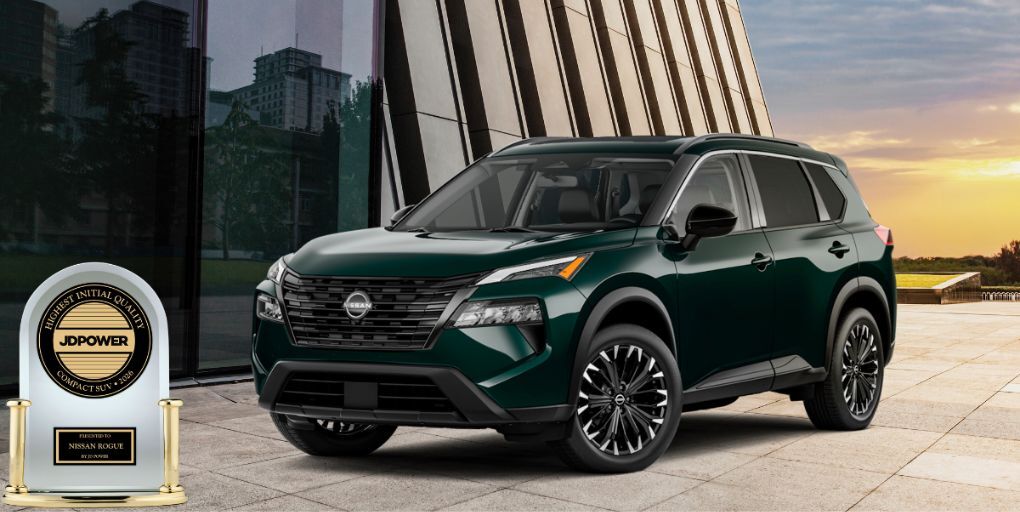
Yet, a front-wheel-drive vehicle need not always default to muted tones. A bright, unyielding yellow on a subcompact FWD model, for instance. A splash of defiance against the monochrome continuum of the morning commute. This car, humble in its drivetrain, asserts itself through pigment. Or a deep, almost iridescent green, a shade once reserved for more exotic machinery, now gracing a compact sedan built for the daily errands. What does this juxtaposition imply? A desire for character, perhaps, an injection of personality into a fundamentally practical object, without the associated cost or complexity of a different chassis layout. It is a quiet rebellion, or simply, a preference.
Manufacturers, they understand these nuances. The palettes chosen for specific models frequently reflect the presumed buyer, the demographic. Does a front-wheel-drive crossover receive a different set of blues or oranges than a rear-wheel-drive performance coupe? Frequently. It is not always obvious, the distinctions. A muted teal versus a vibrant sapphire. Both blue. But the statements they make, vastly divergent. One speaks of calm reliability, of coastal drives. The other, of dynamism, a certain swiftness. These are the small differences, subtly influencing perception, demonstrating how the unseen logic of engineering can quietly shape the very visible canvas. The world is full of these small, curious connections.

No comments:
Post a Comment